im on demo. i did full bonus research for farm and cattle farm and assigned 1 worker to each to compare. i dont have a continent or road bonus. just normal productivity with research. so using average numbers:
farm: +0.9 food; -0.5 wood; -0.25 water
cattle farm: +0.68 food; -0.2 water
cattle farm can also get stuck if you run out of food completely. the farm only gives you 0.22 food more. farm gets bonus for summer; they both get penalty for winter. i dont remember the other events, there was some disease that happens that affects cattle and maybe both. not a big deal if you use doctors.
lol when i went into related it showed dating sims XD
also great game, addicting, if i wasn´t broke from developing my own games I would absolutely buy it on steam! Keep doing this and don´t abandon this game (unless other stuff´s important obviously)
I finally managed to get an idea of how to work with the combine parts interface, and combined some parts. So I went to give the new part a try on a corpus... Of course, changing the design meant scrapping my existing tanks and losing half my experience. Okay, I wanted to improve my army as well as better understand the game, so I went ahead with it.
So I go to back to the build screen to build some tanks... Oh, hey! I cannot build them! I am in the demo mode game, which means--no uranium! I just scrapped my army and lost my experience for something I cannot even access, without any warning?!
Put something in the UI to let us review the build requirements for a design before we commit to it. Especially if it carries some kind of penalty or loss. It wold also be useful to know which parts I can stuff in the trash bin because I cannot use them.
Maybe I'm alone in my thinking, but a demo should inspire a player to upgrade to a paid version, NOT make them 1) feel like they're being held hostage about it--I'll go play something else in that case! And 2) give a player a good idea of what they can expect from the "full" version. If I encounter these kind of issues in a demo, how can I have any confidence that the full version is worth investing in?
Some kind of tutorial or info on he design screens would be helpful. For example, what is a "compatible part?"
Other things that would be nice: A filter to quickly focus on research items available (or filter out those which cannot be further researched)--I seem to spend more and more time scrolling around to find which item I want to, and can, put a tech point in to. While I can see that info when I hover over an item, it would be much nicer and easier to see it all at a glance.
When collapsing in the resource view, a brief summary of the important details would be nice. This is not major, though, the last update already did a lot to improve the UI.
Balance is still a major issue. A lot of things need a lot of metal, yet metal is one of the more limited and scare resources to obtain because (at least the demo version) of the limit of two level 2 mines, and very low production rates overall for them. In the real world, we're surrounded by lots of recoverable metal. In a post-apocalyptic world, I would expect the same. Derelict vehicles, even tanks after battles, unused buildings and equipment/machines/furniture inside them. Being able to scavenge some like with food/water/wood/energy, instead of only being able to mine it, would be a good start--even if limited.
Overall, as it is and the issues above... Once again I have lost interest in the game, and going to go play something else.
It appears the resource production and storage items are aligned in a full grid, rather than columns and then rows. Since I only have two farm production types, but four water production types plus water sources/quality information, this pushes the section for wood way down so the bar for wood aligns with the bottom for water, instead of food. It's as if the layout engine is coded to align by row than column instead. Also, you might want to integrate the water sources/quality section in to the header bar, much like the way mining information is done. This way, players can keep an eye out for problems even when the water section is collapsed from view.
We've resolved this column issue in the new update today - they now properly collapse/expand, as before they only did if the same line was also fully collapsed :)
Actually the suggestion on water sources we resolved exactly like you suggested above as well with the new UI
While working in another program and letting this run idle, I came back to a "new company emerging" event filling the screen--but no matter how many times I clicked the button to continue, it was not doing anything visible (i.e., it was no dismissing the even notification screen). It did seem to continue to save my game, however, and upon fully reloading the page, I only had to go back to a save point from 53 seconds prior.
However, I was letting it idle to build up some iron to build more research centres, but it did seem to "freeze time" while the event notice was on screen as I did not see much of an increase in my iron stores from idling (about an hour's worth). Note that this IS the preferred behaviour, as I wold rather have time frozen at the event than to come back to my empire in flames because I was not siting here to deal with he event! Also note that some events do not seem to do this; Some events will post an "event over" screen which is "on top" of the "event begins" screen, so when I click to continue, it shows the event begins after I dismissed the event over... A little disorientating until I realized what was happening.
I am using Debian Linux v10.3+ (64-bit), Firefox 78.3.0esr (64-bit), which also has NoScript running (but currently disabled as many Steam apps seem to consider NoScript an "ad blocker" and refuse to run).
I cannot provide more information than this as the reload reset my current page load state.
I think we've resolved some of these issues with the newest massive update we uploaded today. Also FYI, later in the game there are research options that allow you to have settings where you can set time to run under these events, events to be auto ignored etc. - We will likely move these settings out of research in a nearby update as well.
To be brutally honest, that is one aspect of this game I do not like: Needing to research UI (User Interface) items, not related to game play. Would you want to play a game that, for example, only ran in 640x480x8 resolution, unless you researched "Higher Resolution and Color Depth" in-game? Only items that might be part of both should be an in-game research-able item (for example, being able to research build/production queues could be both a UI thing AND an in-game thing.) These are the kind of issues which caused me to stop playing the game at all. I want to come home, relax, and enjoy a game after a hard day at work--If I wanted to be stressed and frustrated, I'd stay at work, where they PAY me for it.
Yeah indeed, we need to do some changes here, at the very least with some of the most commonly annoying things most users would want to choose settings.
However, scrapping some sort of automation options through the gameplay we don't want to scrap, as they can feel very rewarding for the player to reach and at the "right time". Even some QoL options (the right ones) can fit this model really well - of course some like "ignore popups"/"don't pause during popups" should be available always, but I think some current and potential new ones could fit very well under research still.
I think you put it nicely - if something can be frustrating, it should be a setting by default. If something improves on something/makes it easier/automated it should in most cases be fine (and potentially even better!) to be part of research.
Side note , The orange bar under "exploring" jerks a little left and right as it's filling, pretty constantly. Bouncing one little notch left/right, sometimes two little notches. But the bar still fills at a consistent rate so I'd guess it's just visual.
← Return to game
Comments
Log in with itch.io to leave a comment.
Cant scroll the research tab on vr
im on demo. i did full bonus research for farm and cattle farm and assigned 1 worker to each to compare. i dont have a continent or road bonus. just normal productivity with research. so using average numbers:
farm:
+0.9 food; -0.5 wood; -0.25 water
cattle farm:
+0.68 food; -0.2 water
cattle farm can also get stuck if you run out of food completely. the farm only gives you 0.22 food more. farm gets bonus for summer; they both get penalty for winter. i dont remember the other events, there was some disease that happens that affects cattle and maybe both. not a big deal if you use doctors.
same thing with forests
planted forest:
+1.8 wood; -0.2 water
pine forest:
+1.04 wood; -0.2 water
Nice game – too bad it's not available for MacOS.
Hi, the windows version is stuck on the initial loading screen.
Looks okay, however I cannot seem to scroll the research page in the browser version on my tablet.
Reach EOC and it was quite the trip. Defo on my list for later.
Played for 2 or 3 hours, It's a good game.
this may sound like alot but can you get this on play store
really good
lol when i went into related it showed dating sims XD
also great game, addicting, if i wasn´t broke from developing my own games I would absolutely buy it on steam! Keep doing this and don´t abandon this game (unless other stuff´s important obviously)
More issues:
I finally managed to get an idea of how to work with the combine parts interface, and combined some parts. So I went to give the new part a try on a corpus... Of course, changing the design meant scrapping my existing tanks and losing half my experience. Okay, I wanted to improve my army as well as better understand the game, so I went ahead with it.
So I go to back to the build screen to build some tanks... Oh, hey! I cannot build them! I am in the demo mode game, which means--no uranium! I just scrapped my army and lost my experience for something I cannot even access, without any warning?!
Put something in the UI to let us review the build requirements for a design before we commit to it. Especially if it carries some kind of penalty or loss. It wold also be useful to know which parts I can stuff in the trash bin because I cannot use them.
Maybe I'm alone in my thinking, but a demo should inspire a player to upgrade to a paid version, NOT make them 1) feel like they're being held hostage about it--I'll go play something else in that case! And 2) give a player a good idea of what they can expect from the "full" version. If I encounter these kind of issues in a demo, how can I have any confidence that the full version is worth investing in?
Some kind of tutorial or info on he design screens would be helpful. For example, what is a "compatible part?"
Other things that would be nice: A filter to quickly focus on research items available (or filter out those which cannot be further researched)--I seem to spend more and more time scrolling around to find which item I want to, and can, put a tech point in to. While I can see that info when I hover over an item, it would be much nicer and easier to see it all at a glance.
When collapsing in the resource view, a brief summary of the important details would be nice. This is not major, though, the last update already did a lot to improve the UI.
Balance is still a major issue. A lot of things need a lot of metal, yet metal is one of the more limited and scare resources to obtain because (at least the demo version) of the limit of two level 2 mines, and very low production rates overall for them. In the real world, we're surrounded by lots of recoverable metal. In a post-apocalyptic world, I would expect the same. Derelict vehicles, even tanks after battles, unused buildings and equipment/machines/furniture inside them. Being able to scavenge some like with food/water/wood/energy, instead of only being able to mine it, would be a good start--even if limited.
Overall, as it is and the issues above... Once again I have lost interest in the game, and going to go play something else.
Suggestion:
It appears the resource production and storage items are aligned in a full grid, rather than columns and then rows. Since I only have two farm production types, but four water production types plus water sources/quality information, this pushes the section for wood way down so the bar for wood aligns with the bottom for water, instead of food. It's as if the layout engine is coded to align by row than column instead. Also, you might want to integrate the water sources/quality section in to the header bar, much like the way mining information is done. This way, players can keep an eye out for problems even when the water section is collapsed from view.
We've resolved this column issue in the new update today - they now properly collapse/expand, as before they only did if the same line was also fully collapsed :)
Actually the suggestion on water sources we resolved exactly like you suggested above as well with the new UI
Bug:
While working in another program and letting this run idle, I came back to a "new company emerging" event filling the screen--but no matter how many times I clicked the button to continue, it was not doing anything visible (i.e., it was no dismissing the even notification screen). It did seem to continue to save my game, however, and upon fully reloading the page, I only had to go back to a save point from 53 seconds prior.
However, I was letting it idle to build up some iron to build more research centres, but it did seem to "freeze time" while the event notice was on screen as I did not see much of an increase in my iron stores from idling (about an hour's worth). Note that this IS the preferred behaviour, as I wold rather have time frozen at the event than to come back to my empire in flames because I was not siting here to deal with he event! Also note that some events do not seem to do this; Some events will post an "event over" screen which is "on top" of the "event begins" screen, so when I click to continue, it shows the event begins after I dismissed the event over... A little disorientating until I realized what was happening.
I am using Debian Linux v10.3+ (64-bit), Firefox 78.3.0esr (64-bit), which also has NoScript running (but currently disabled as many Steam apps seem to consider NoScript an "ad blocker" and refuse to run).
I cannot provide more information than this as the reload reset my current page load state.
Hey, Thanks for the info!
I think we've resolved some of these issues with the newest massive update we uploaded today. Also FYI, later in the game there are research options that allow you to have settings where you can set time to run under these events, events to be auto ignored etc. - We will likely move these settings out of research in a nearby update as well.
To be brutally honest, that is one aspect of this game I do not like: Needing to research UI (User Interface) items, not related to game play. Would you want to play a game that, for example, only ran in 640x480x8 resolution, unless you researched "Higher Resolution and Color Depth" in-game? Only items that might be part of both should be an in-game research-able item (for example, being able to research build/production queues could be both a UI thing AND an in-game thing.) These are the kind of issues which caused me to stop playing the game at all. I want to come home, relax, and enjoy a game after a hard day at work--If I wanted to be stressed and frustrated, I'd stay at work, where they PAY me for it.
Yeah indeed, we need to do some changes here, at the very least with some of the most commonly annoying things most users would want to choose settings.
However, scrapping some sort of automation options through the gameplay we don't want to scrap, as they can feel very rewarding for the player to reach and at the "right time". Even some QoL options (the right ones) can fit this model really well - of course some like "ignore popups"/"don't pause during popups" should be available always, but I think some current and potential new ones could fit very well under research still.
I think you put it nicely - if something can be frustrating, it should be a setting by default. If something improves on something/makes it easier/automated it should in most cases be fine (and potentially even better!) to be part of research.
The buttons to add and remove people from the "Exploring" section are underneath the progress bar.
Can you give a screenshot please, and what browser are you using?
I am using Firefox, I could only click it once, just barely in fullscreen mode
Thanks!
I think I might've found an issue. Update will be uploaded later today with a bunch of other things :)
Posted an update for this as well earlier, could you please check if it fixed it for you?
Yup yup, fixed c: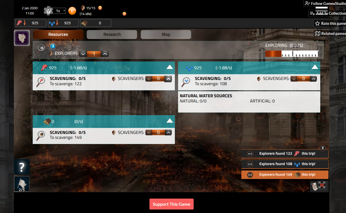
Great, thanks for confirmation!
Side note , The orange bar under "exploring" jerks a little left and right as it's filling, pretty constantly. Bouncing one little notch left/right, sometimes two little notches. But the bar still fills at a consistent rate so I'd guess it's just visual.
Ah yes, that twitch, it's on our list already to improve.